The visual identity for Dokument Magazín (The Archive of Slovak Photography) was designed to celebrate the first anniversary of the collective and reflect its essential purpose - to map the history of Slovak photography.
Initial stages of the creative process consisted of the primary research of Dokument as well as similar institutions, relevant visual material, and theoretical resources. After conducting research on the linguistic meanings of the term “dokument” (document) and “to document”, a printed document as the official archival record became the primary element of the design strategy. However, it was also essential for the client to emphasise the importance of the historic connotations the collective aims to preserve, and therefore, we traced back for visual inspiration to the old-school Slovakia before 1993, often seen on the photographs from the archive itself, and used that as a secondary guide for the stylistic choices when developing the visual language.
Considering the budget limitations, the client preferred to focus on subtle rather than drastic changes of the identity, and therefore, a series of social media templates, posters as well as logo became the outcomes of the commission.
Combinations of neon shades derived from the CMYK palette with complimentary muted tones of grey, beige, and brown came to define the main colours of the visual identity. Implementation of the photographs from the archive, the usage of typefaces such as GT Sectra and GT America and applications of geometric structures, became the central elements of the visual language.
Following a successful re-branding, I was further commissioned to design merchandise for the archive, which is currently in the process of development.


Colour palette
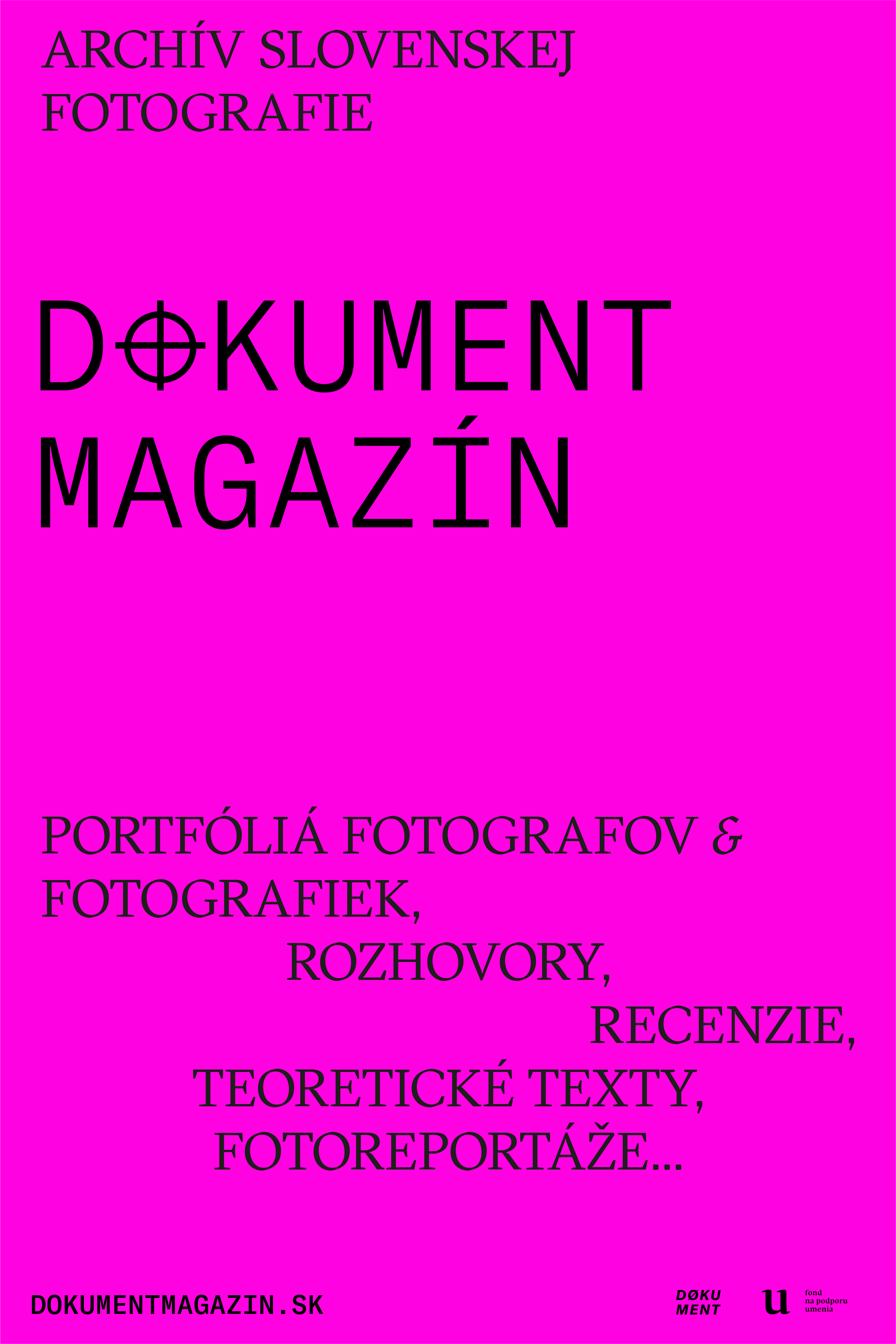


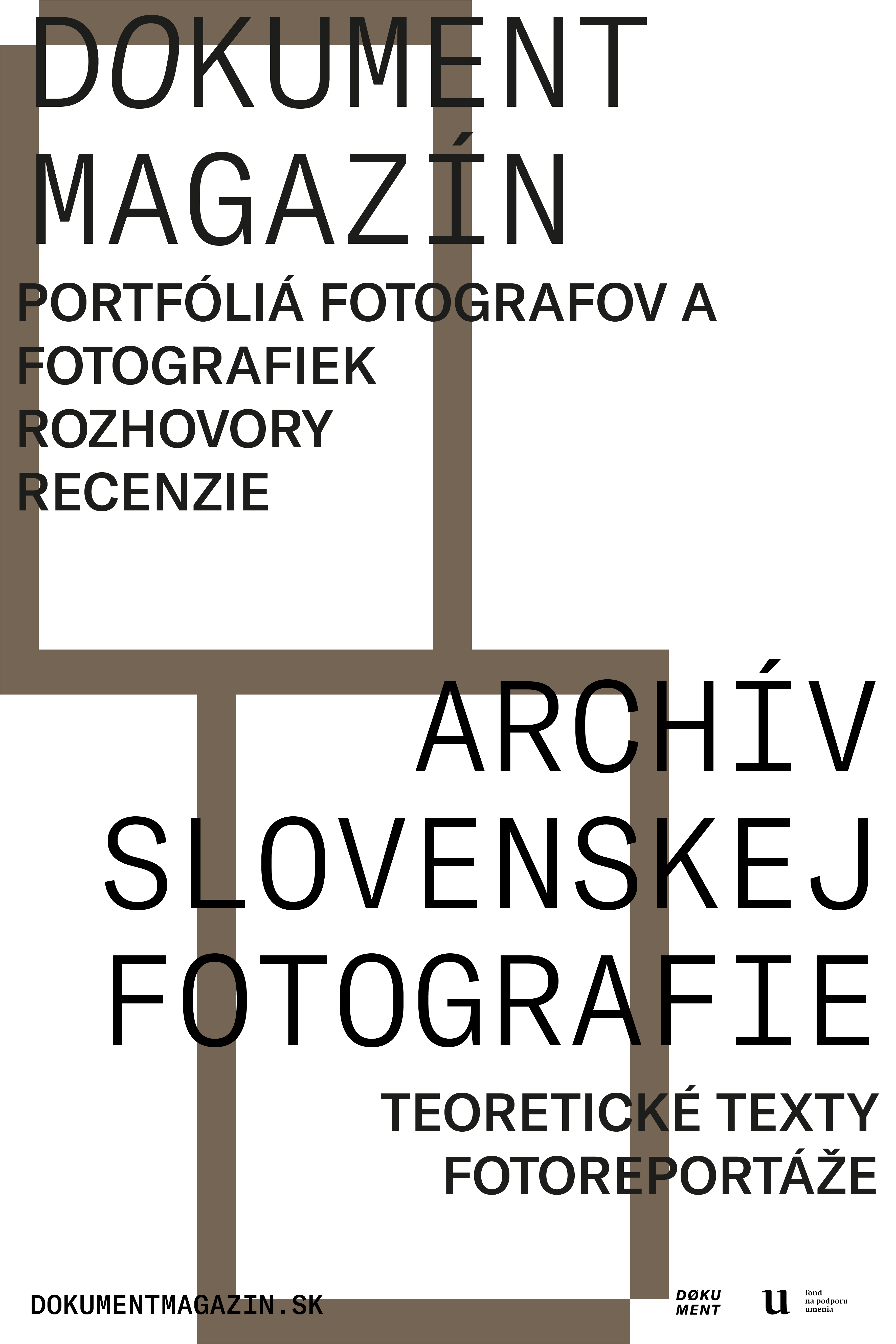


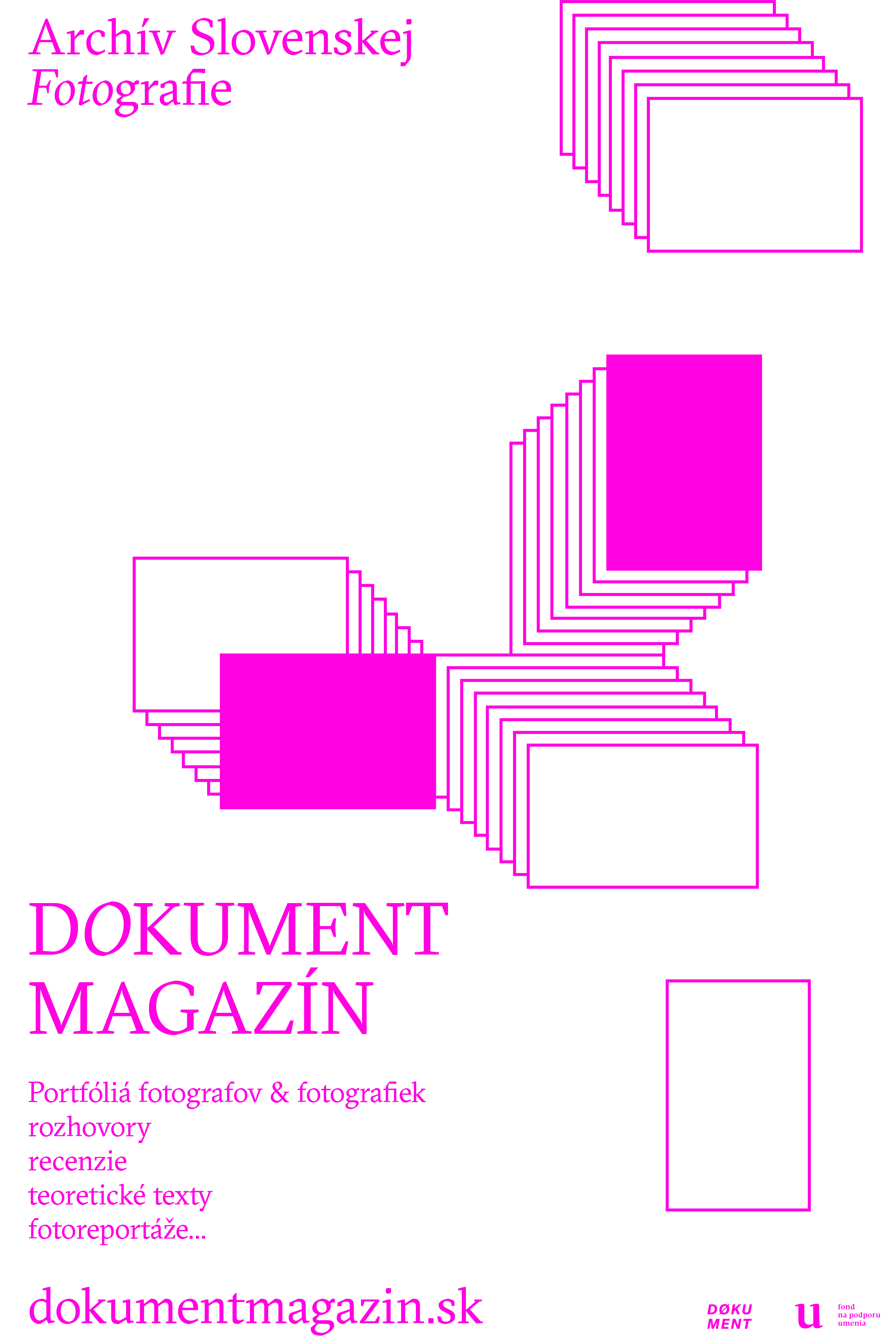
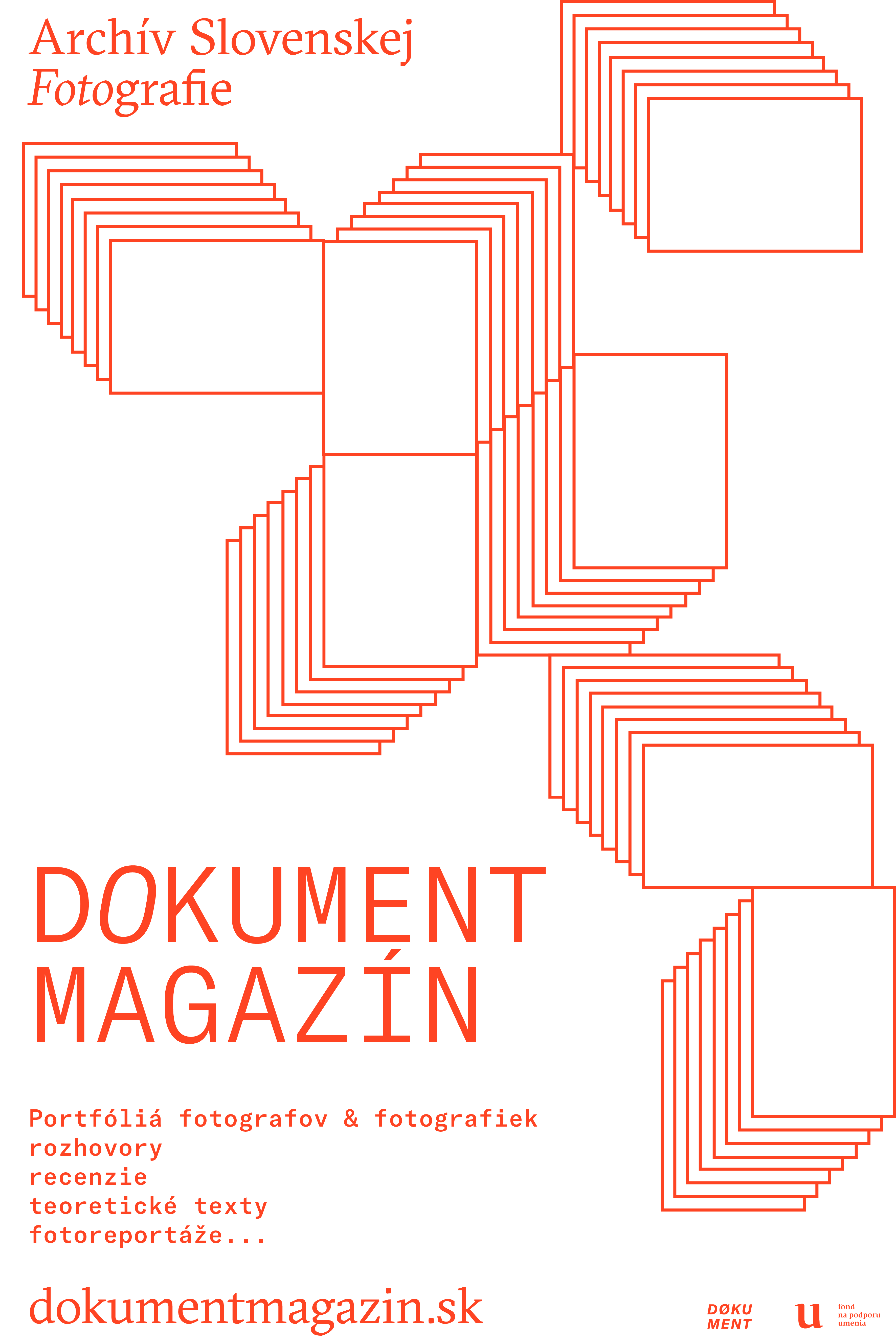
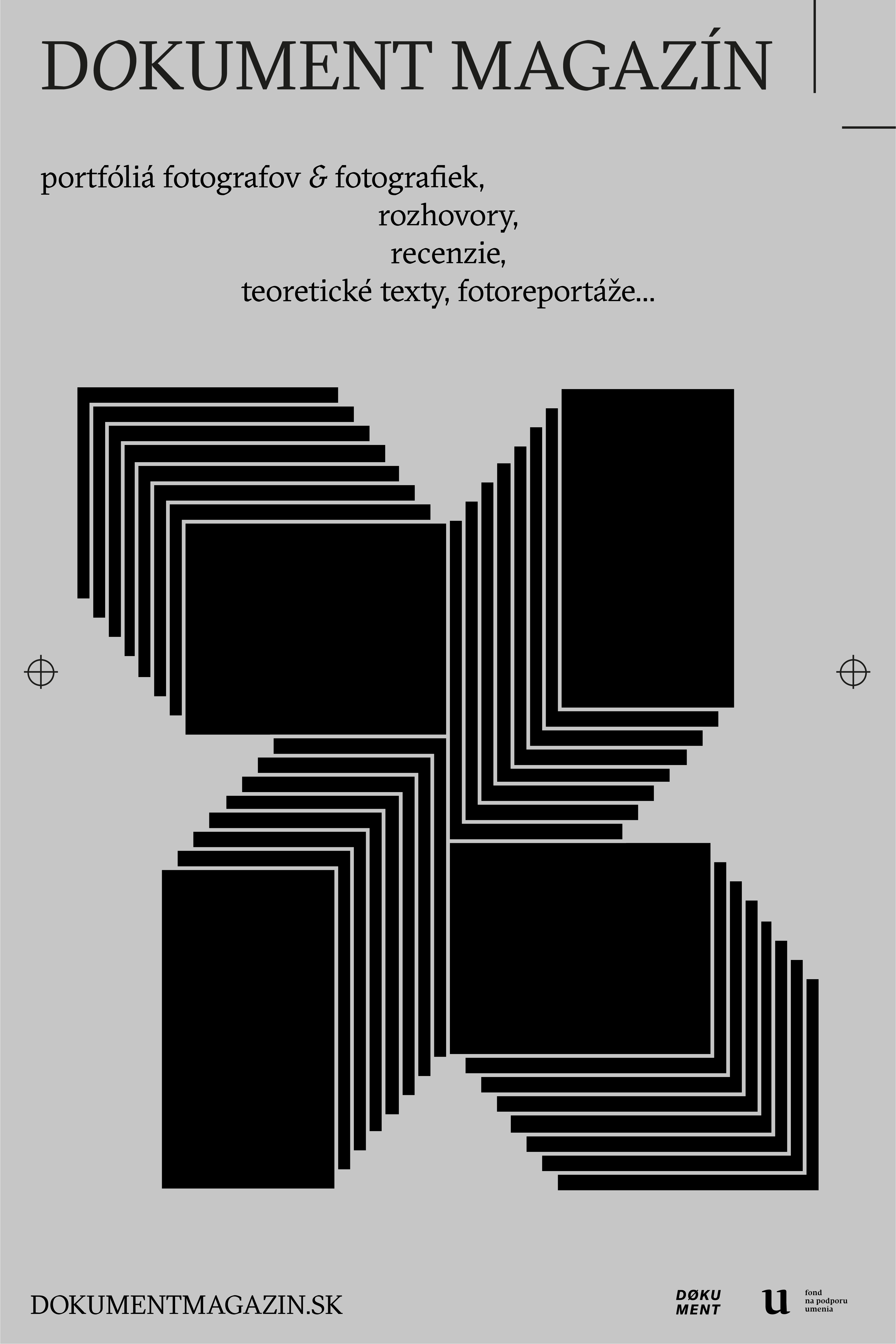
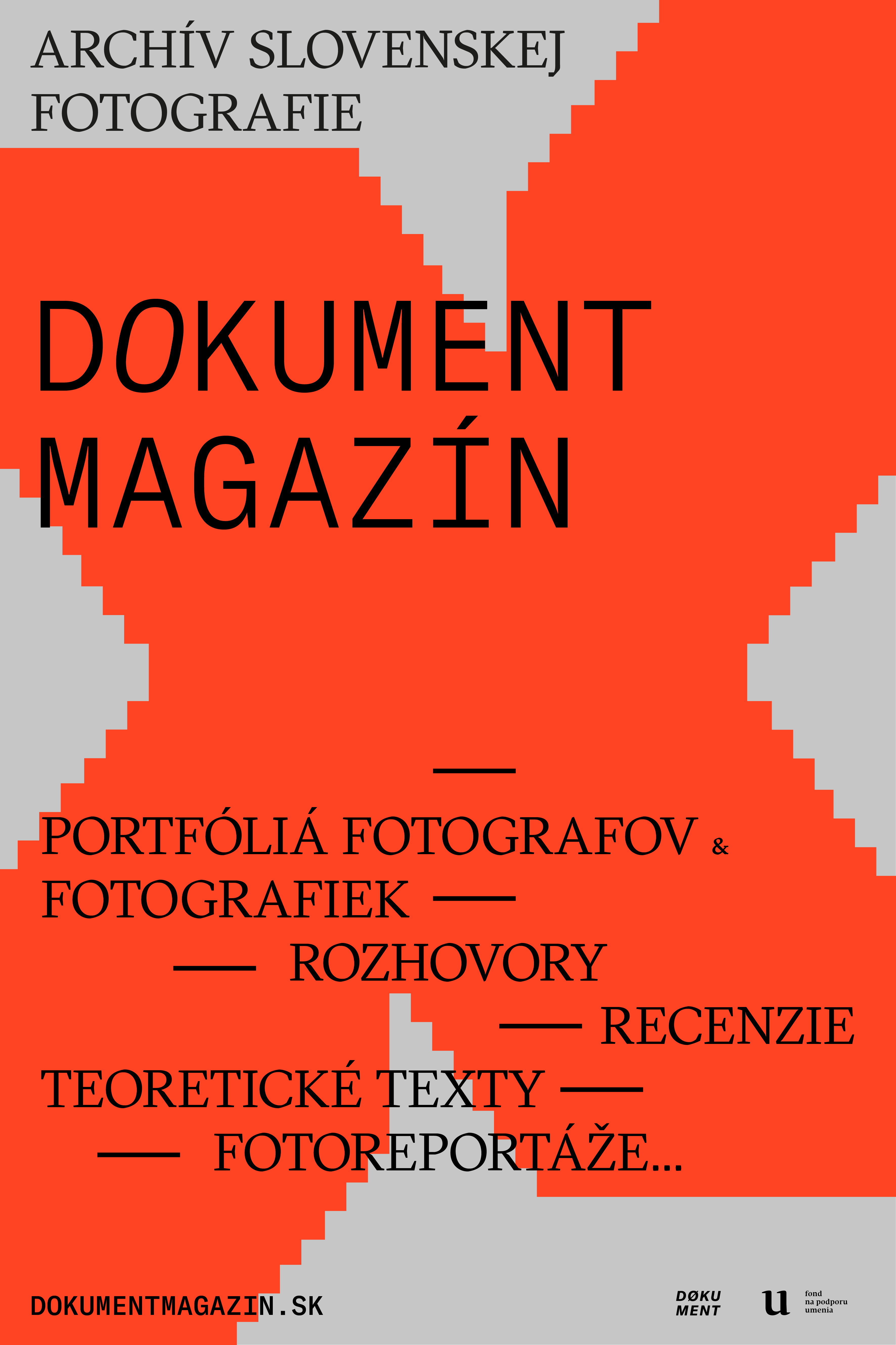

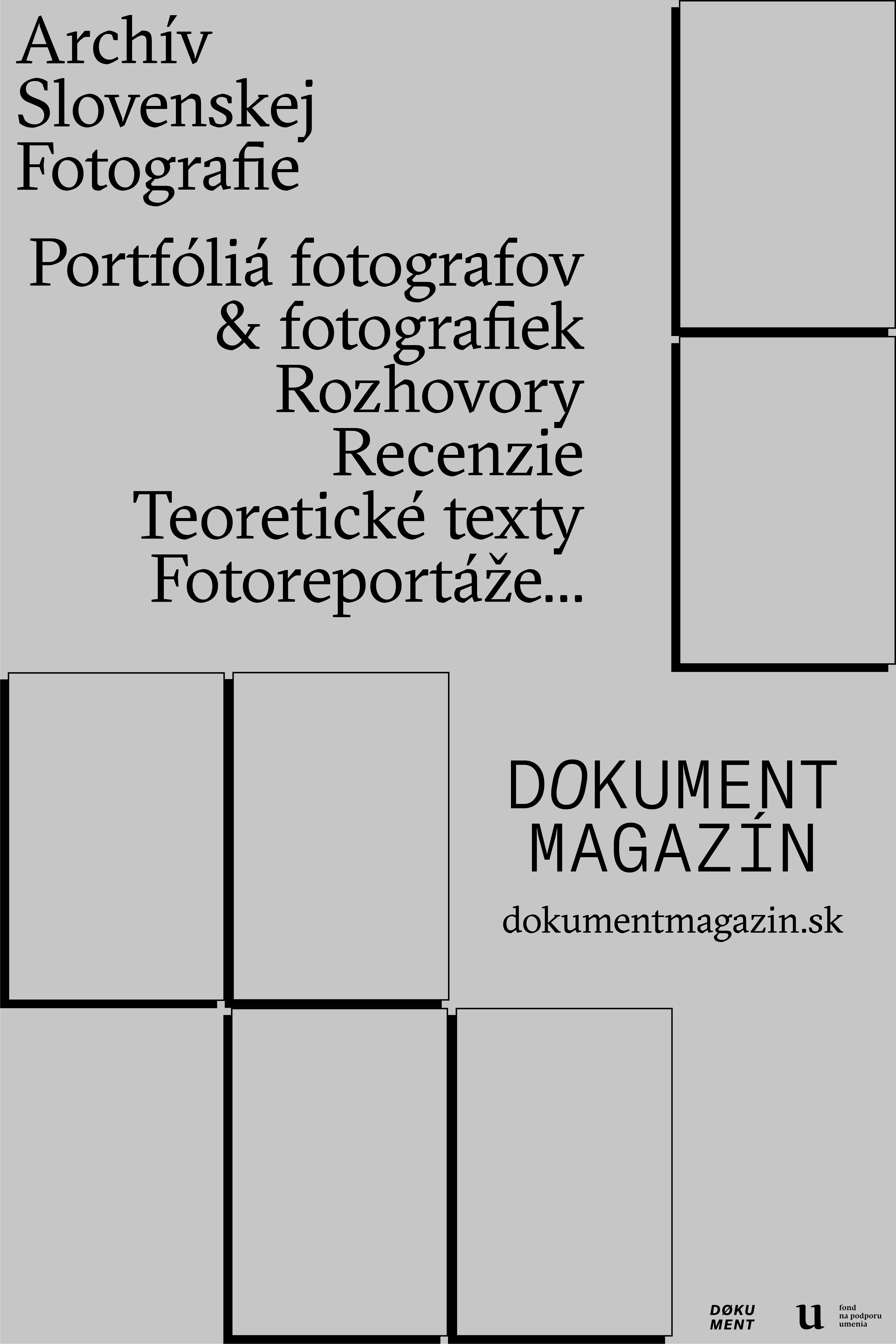
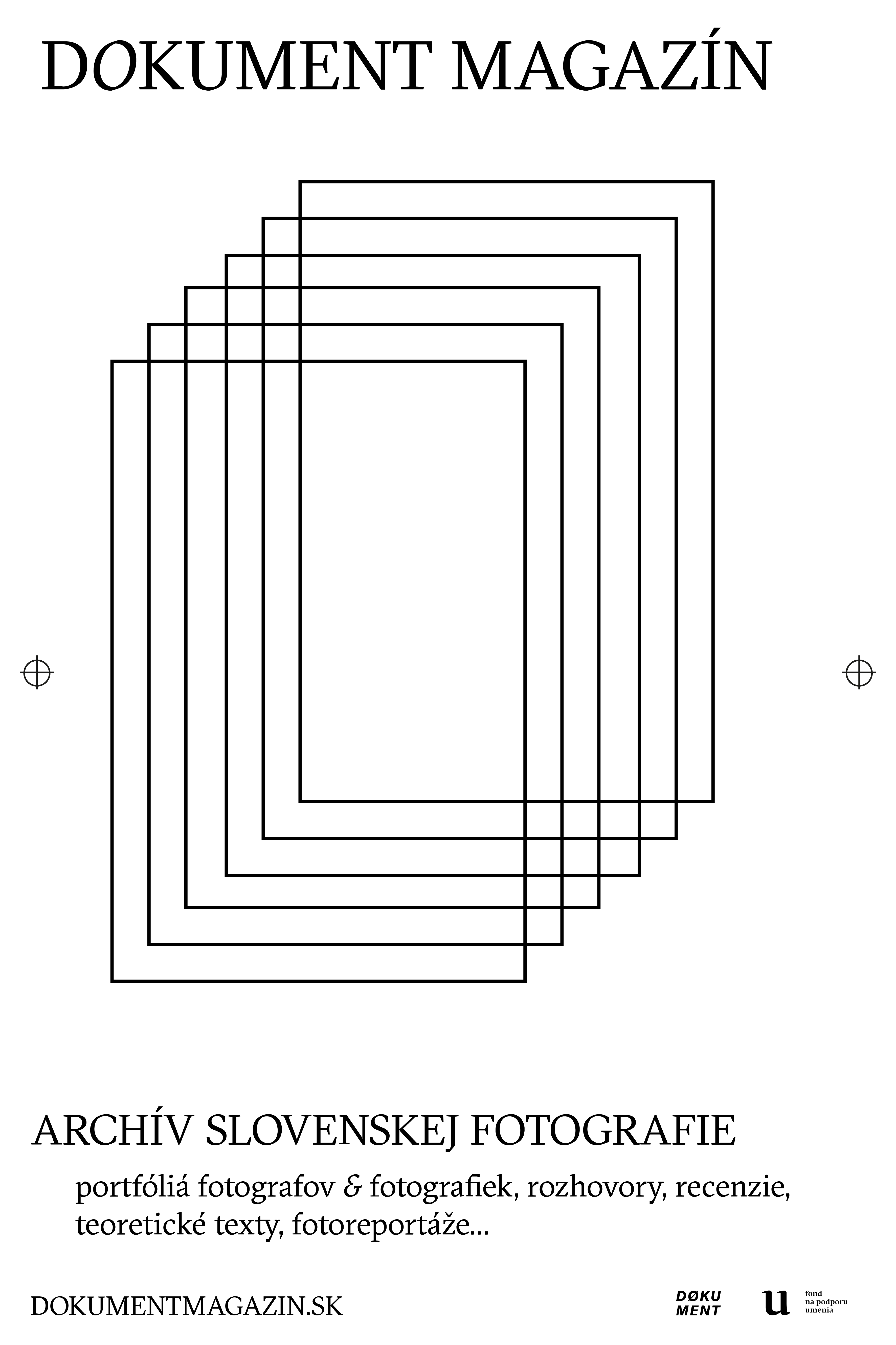

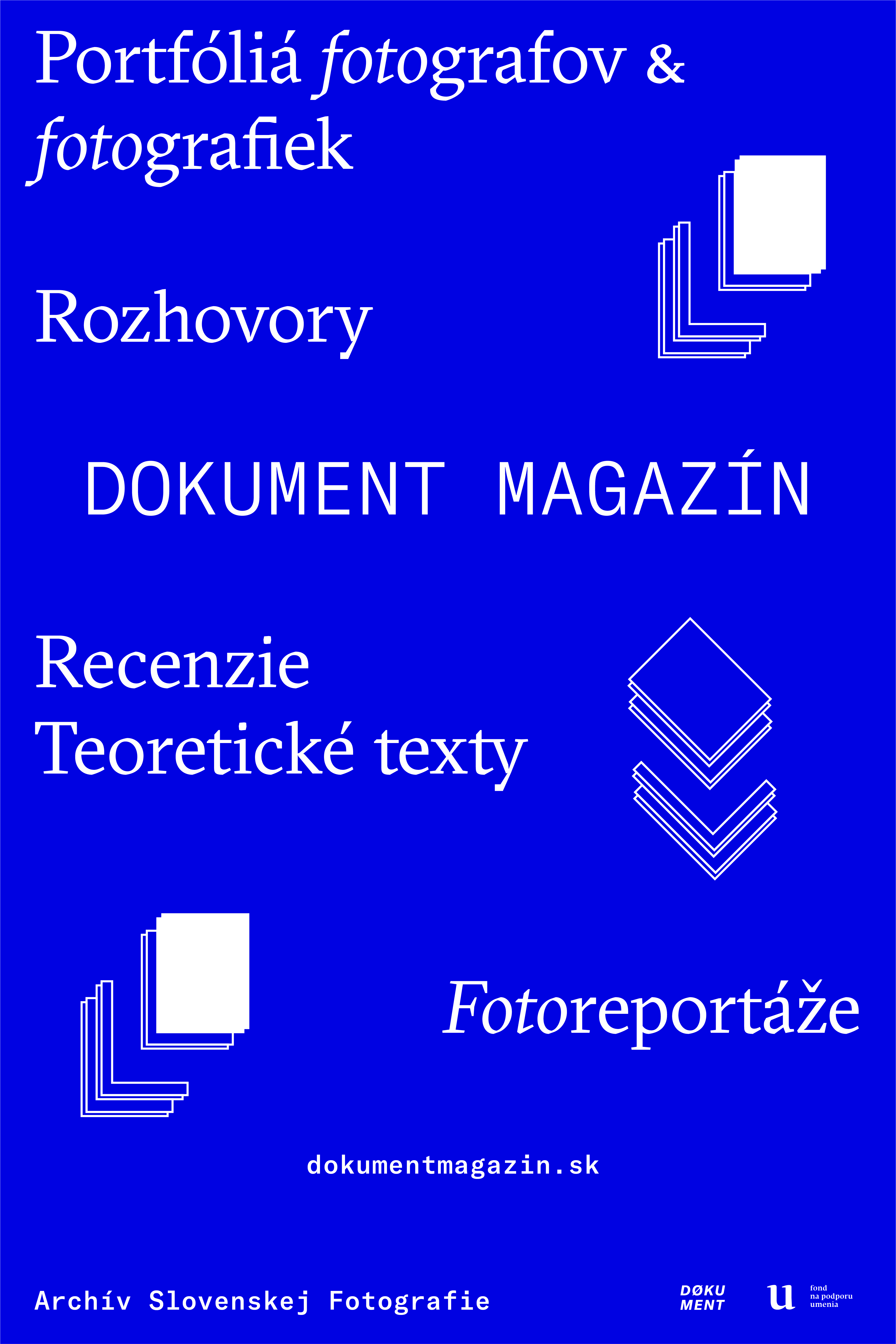

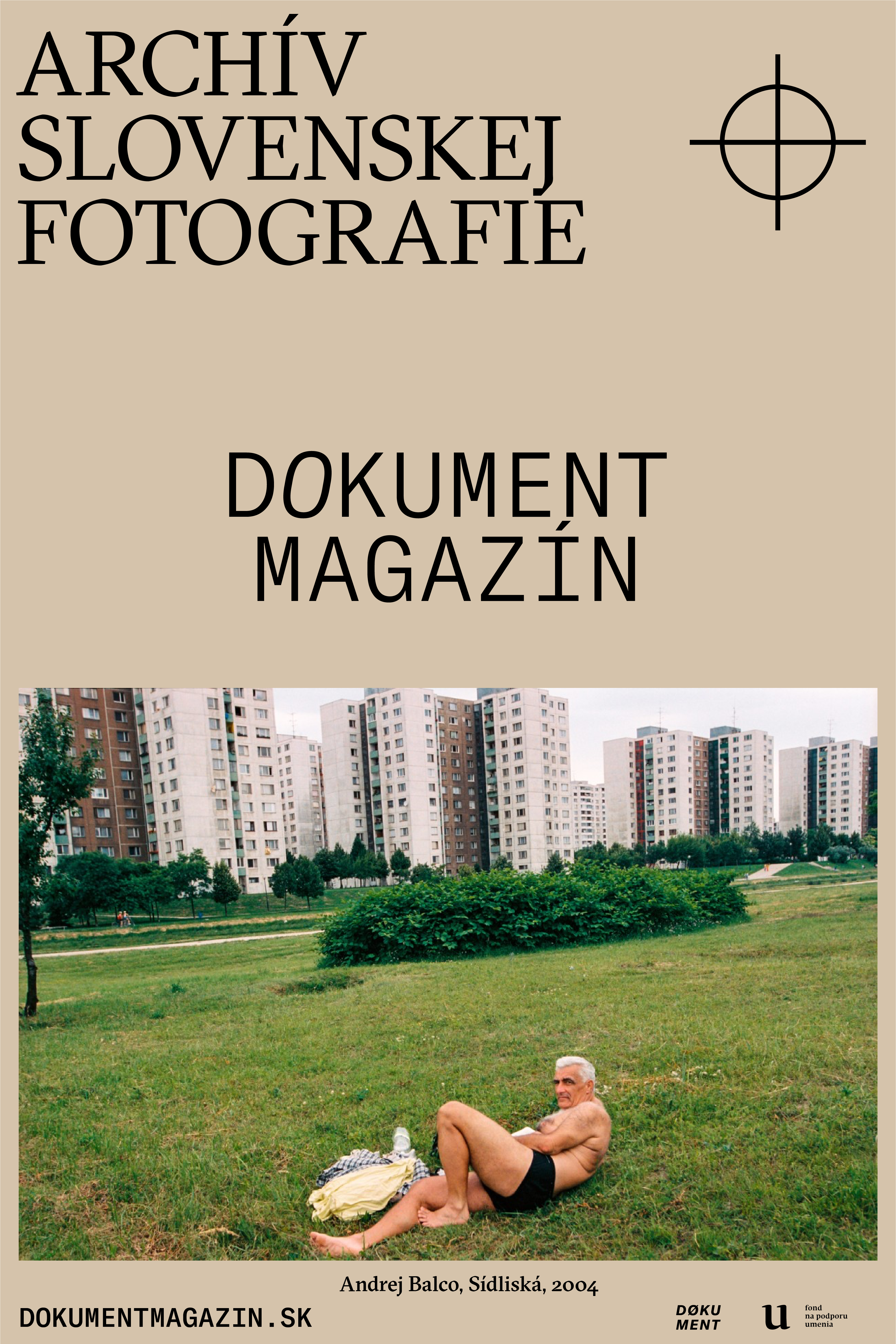
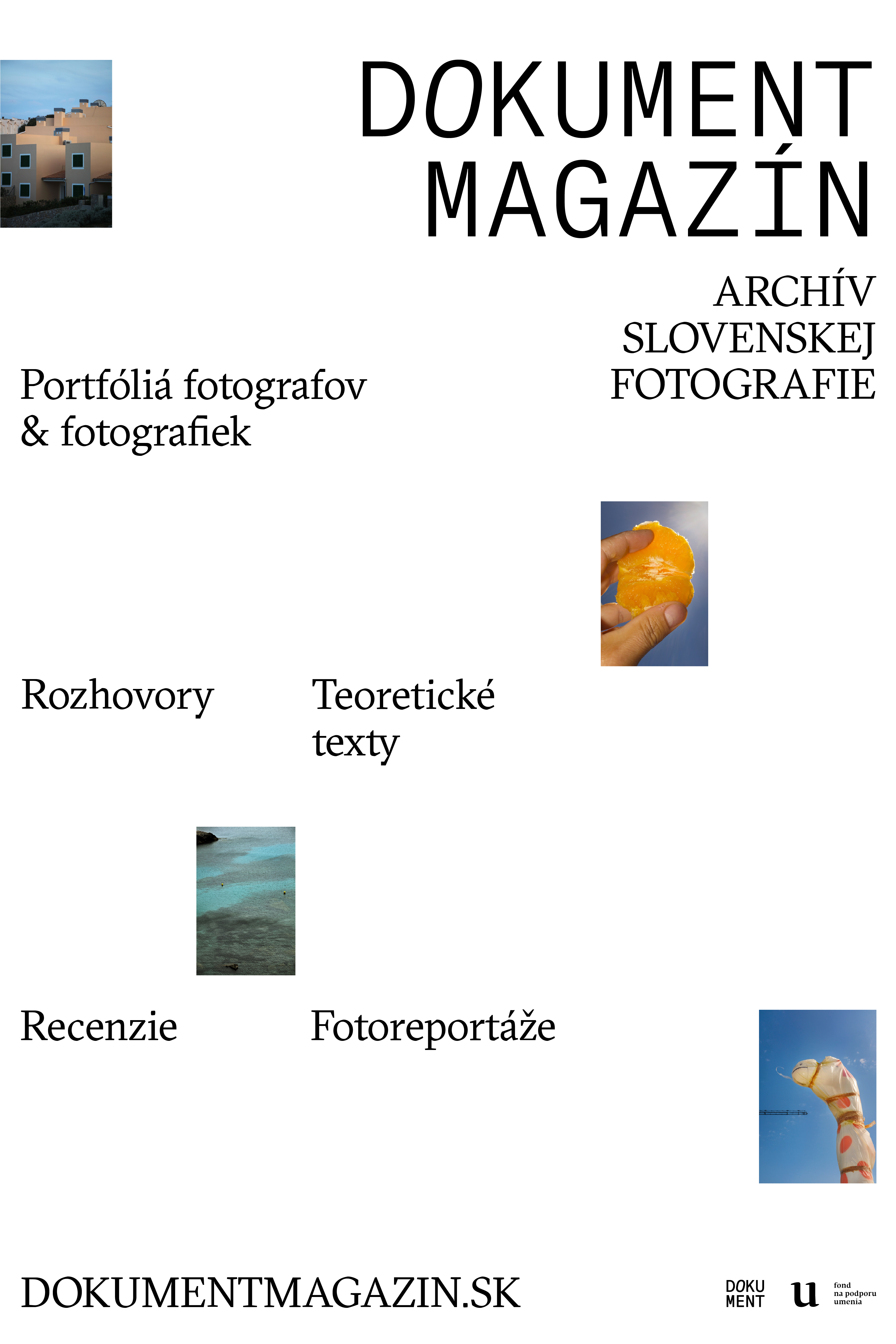
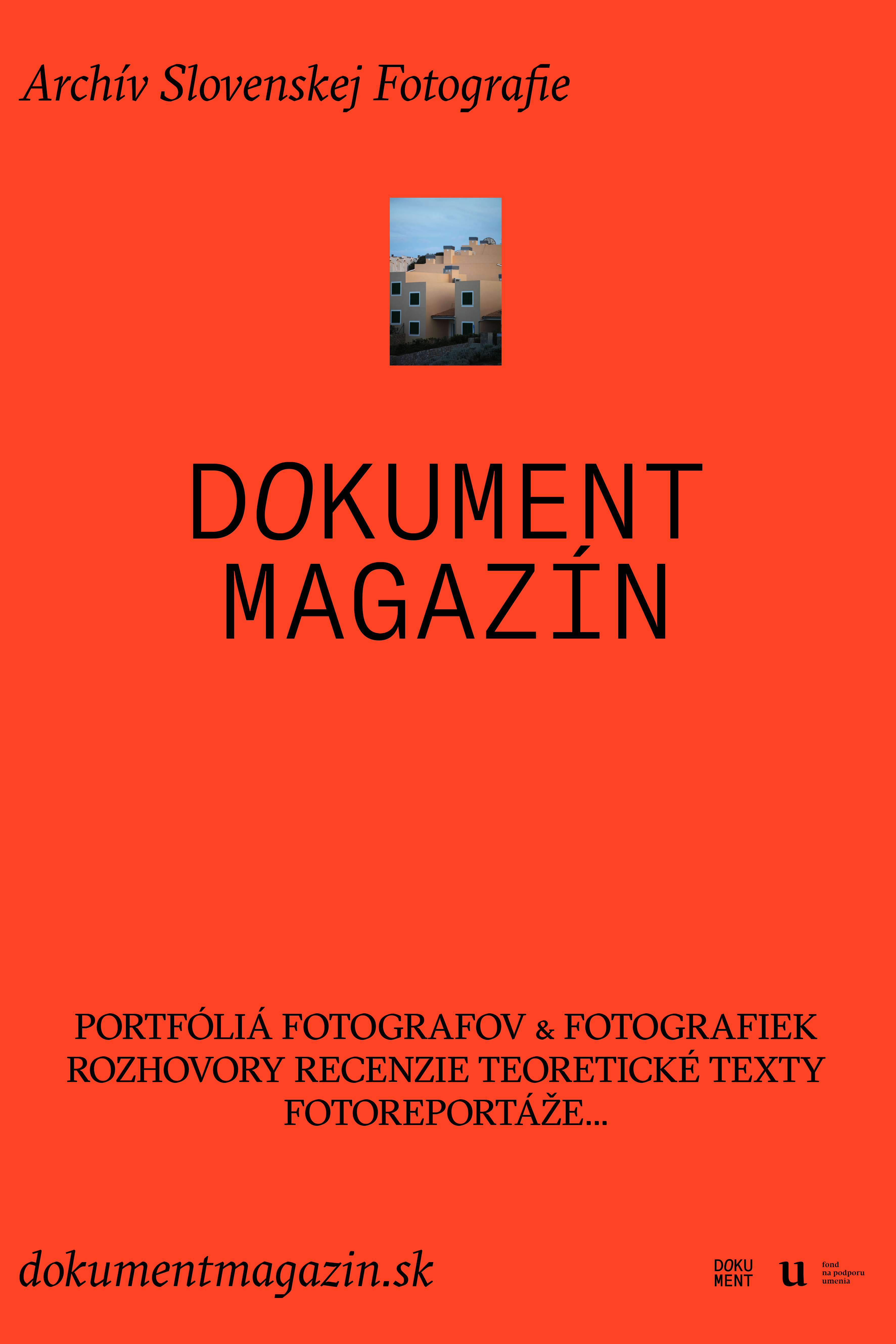

Selection of the digital posters designed for Dokument Magazín to promote it online
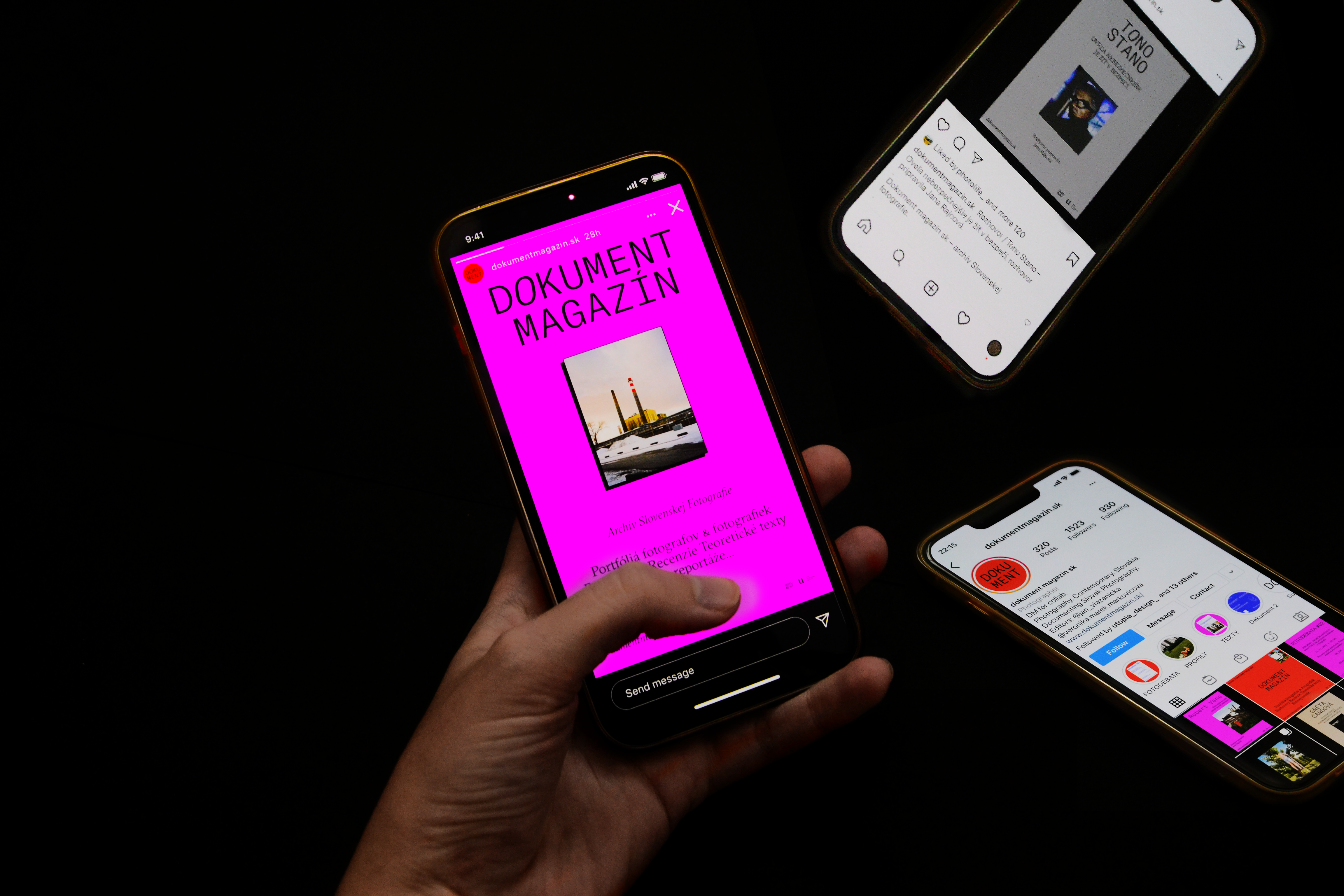
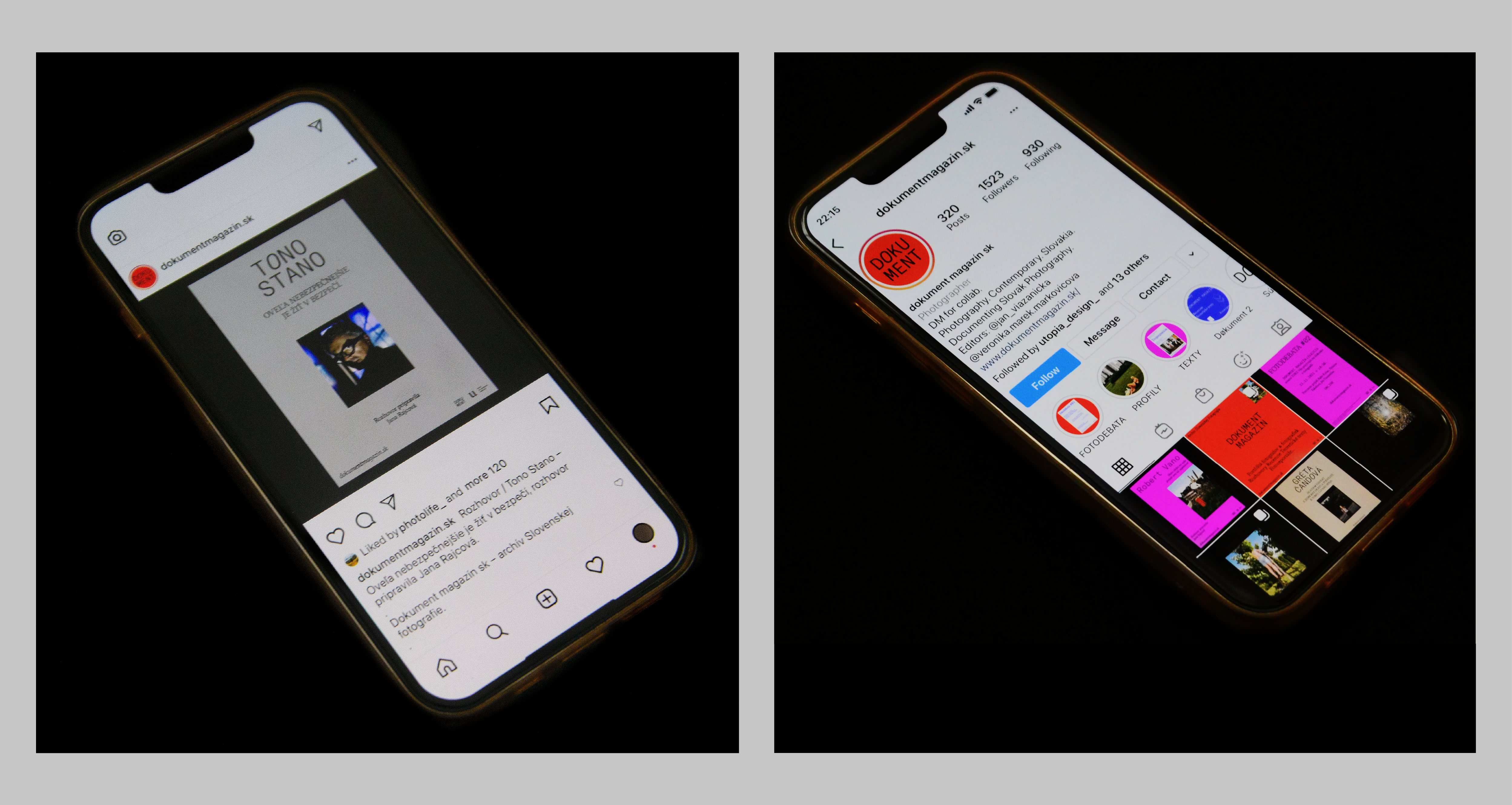
 Proposed design of the visuals for Instagram account
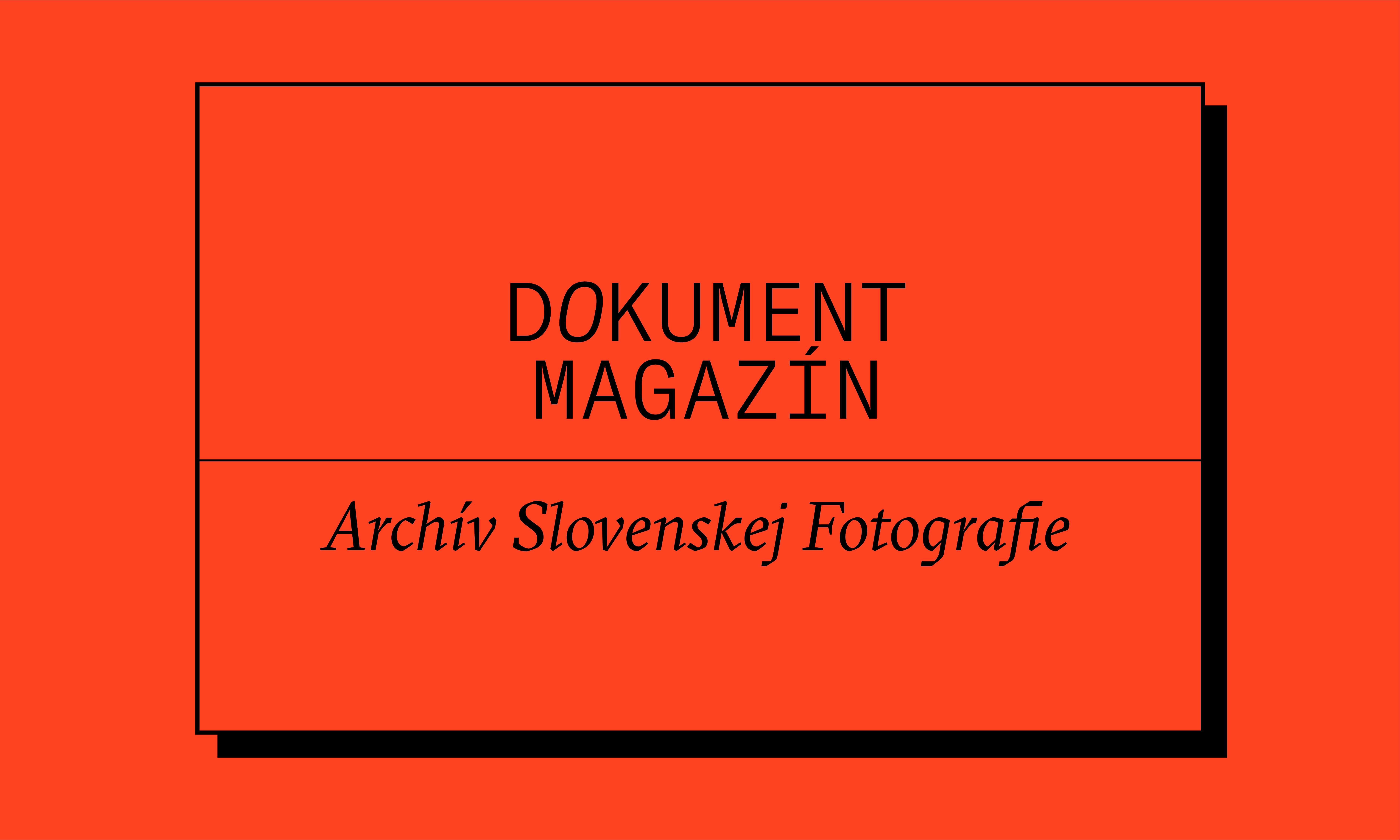


© 2022 Ivana Havadejová