The Undercroft Scratch Festival
The branding proposal for The Undercroft Scratch Festival was designed to advertise the festival of youth dance and performance based in Kingston Upon Thames. Imagining the possibilities of the undercroft underground space as a pop-up site for a festival of community and creativity working with and for the local community was the key feature of the brief.
The clients from the Creative Youth asked for inventive, creative, expressive, rebellious, provocative and clever designs to promote their live festival.
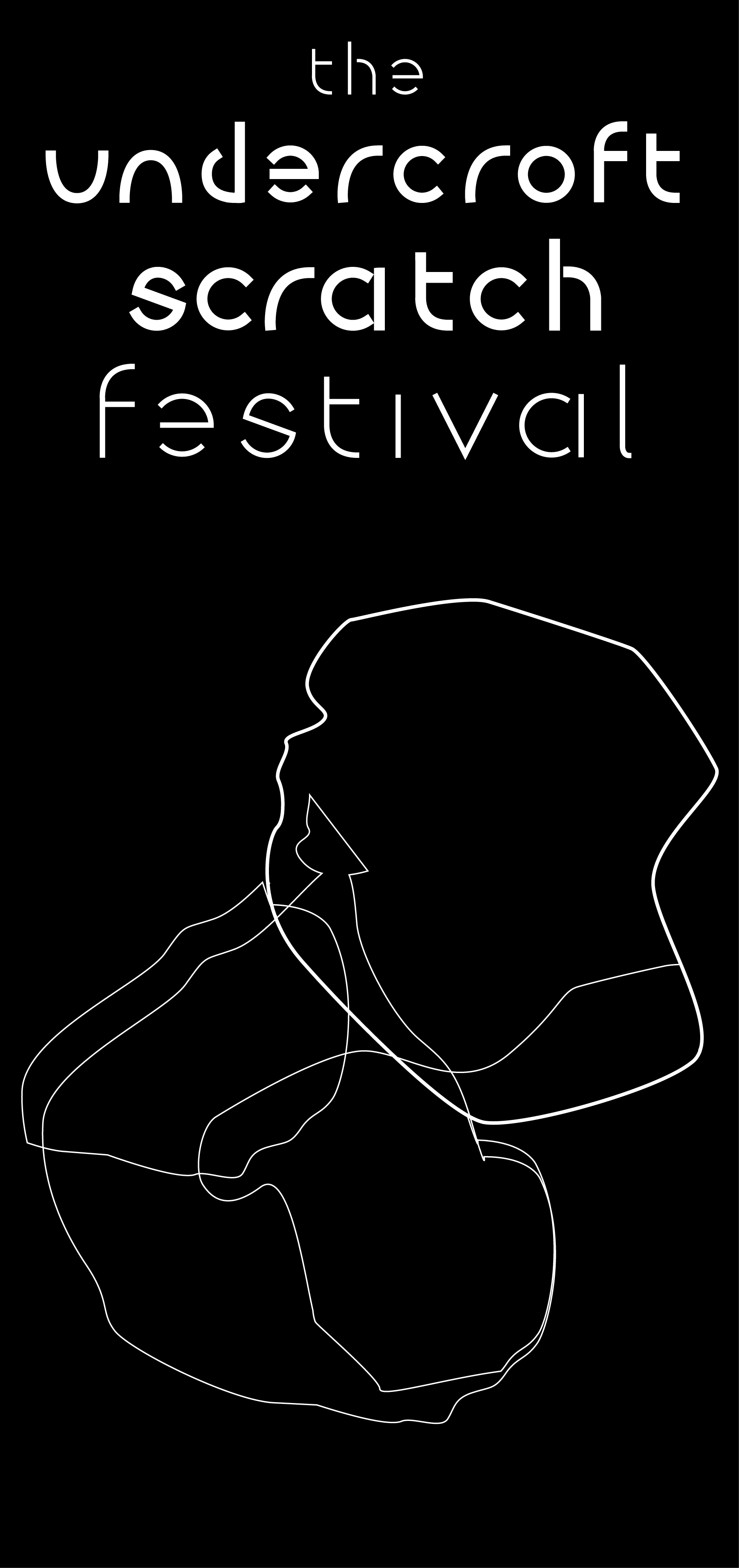
The visual strategy my team came up with was therefore developed with a strong focus on the line, later used as the main graphic element of the poster prototypes.In this way, the visuals were able to adequately capture the connection and movement the team identified as the most important aspects of the festival after visiting its appointed location, conducting primary research on-site, and brainstorming various ideas.
Similarly, the custom font designed by Mio Im, which can be seen in all of the featured works on this website, was primarily inspired by the shapes of rocks discovered at the location as well as the line element representing our key visual strategy.
The colour palette was similarily identified after visiting the location and carrying out the first series of visual experiments. We mostly focused on utilising bright, however, contrasting colour combinations to encompass the youthful energy of the festival, although not forgetting the underground character of the its location.
The client feedback received in the early stages of the design process was effective in determining the final visual direction of the project, particularly helping the visual language to move from a rather busy and chaotic- implementing the visual principles of the acid graphics- to more refined and minimalist visual compositions, tracing back inspiration to the modernist era.
Since the clients primarily asked for the posters and brochures, due to a limited budget, we focused on designing prototypes of those that can be seen on this website.

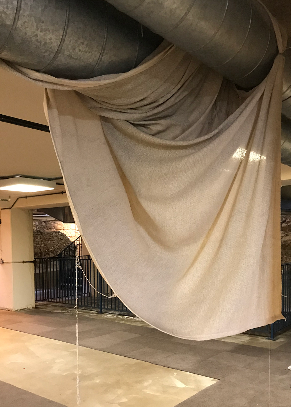
Images of the location that served as the main inspiration for the visual identity
Logo variations utilising the rock symbol as the main visual element

symbols utilising line as the central visual element


undercroft font designed by Mio Im and edited by me


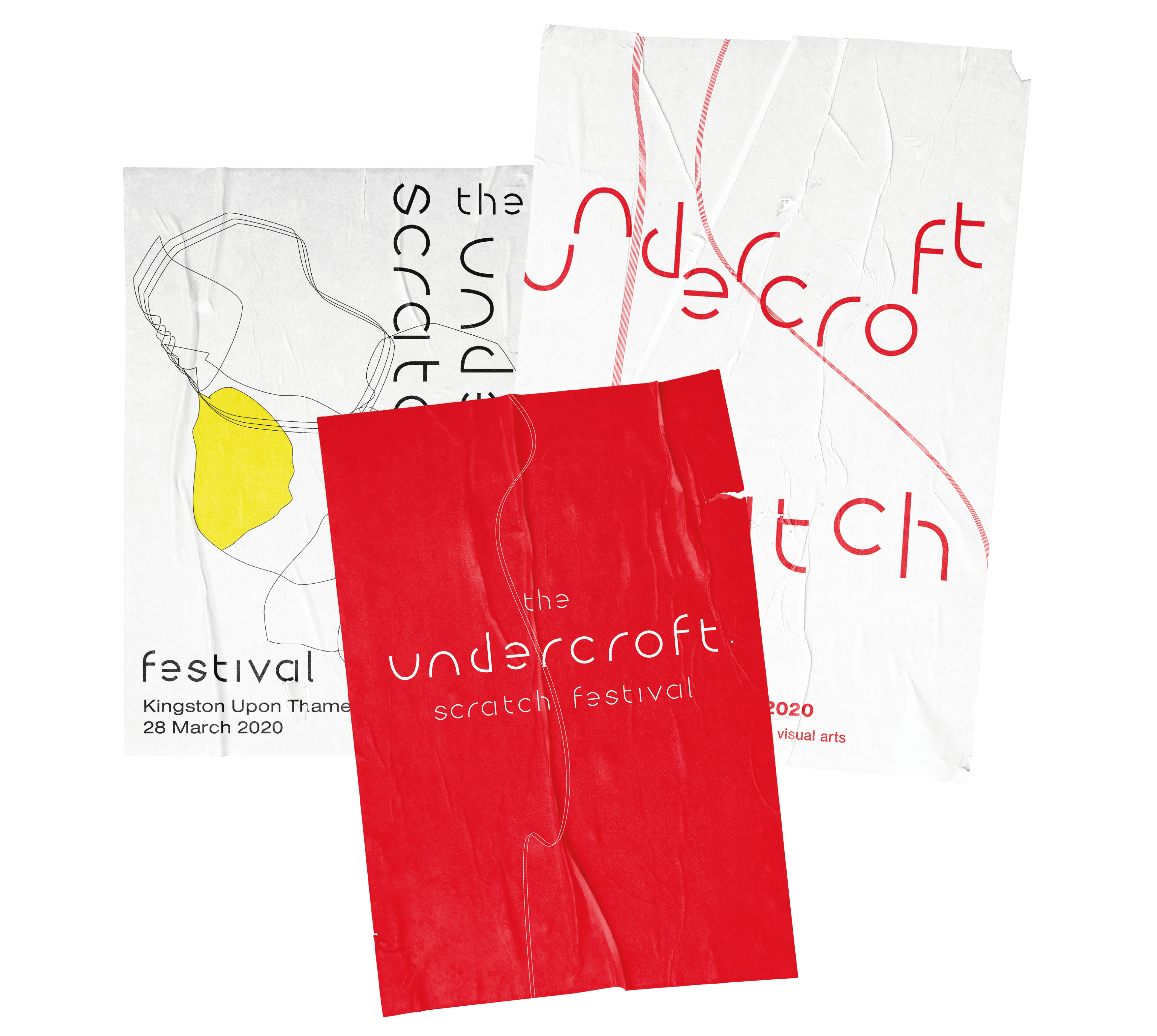

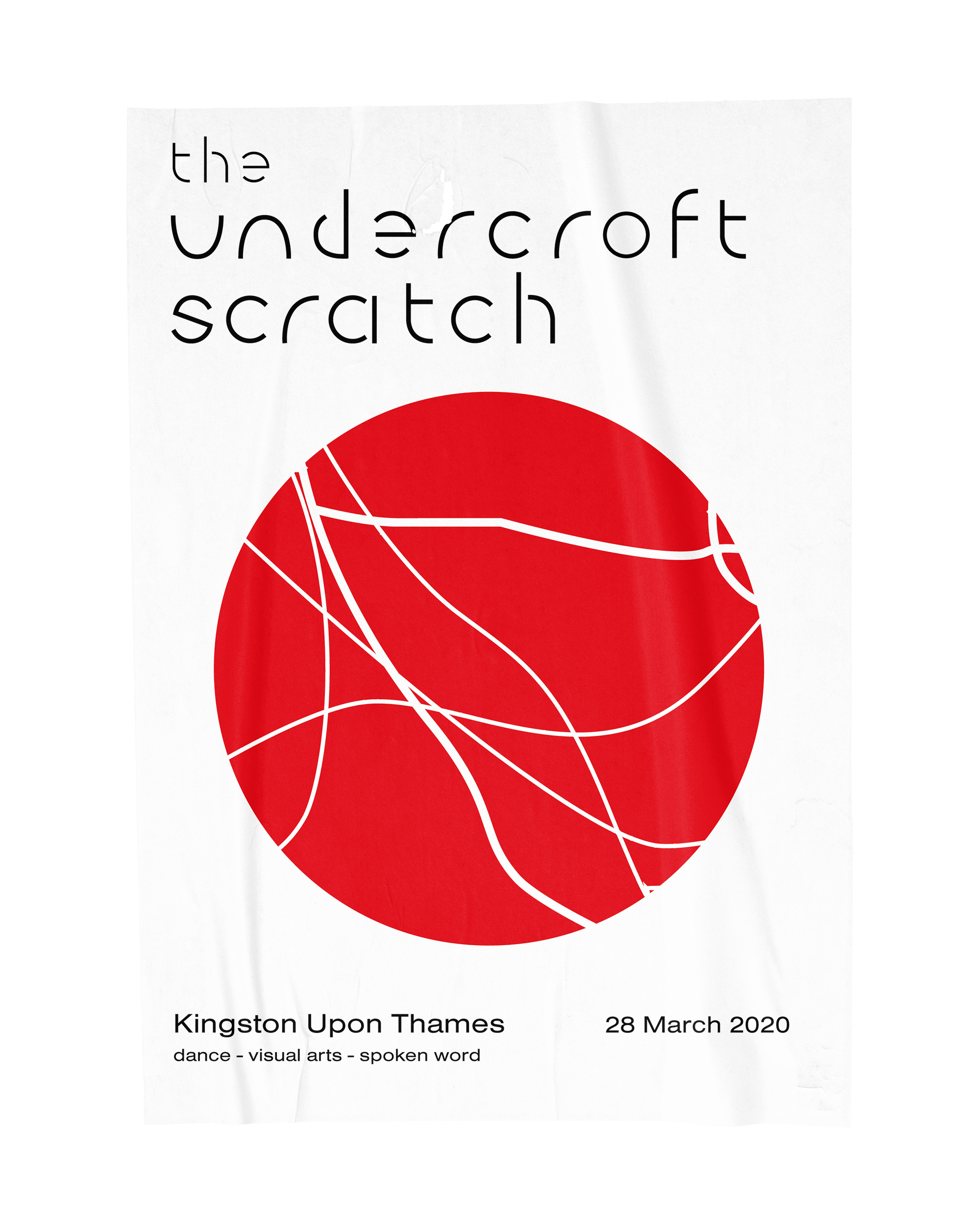
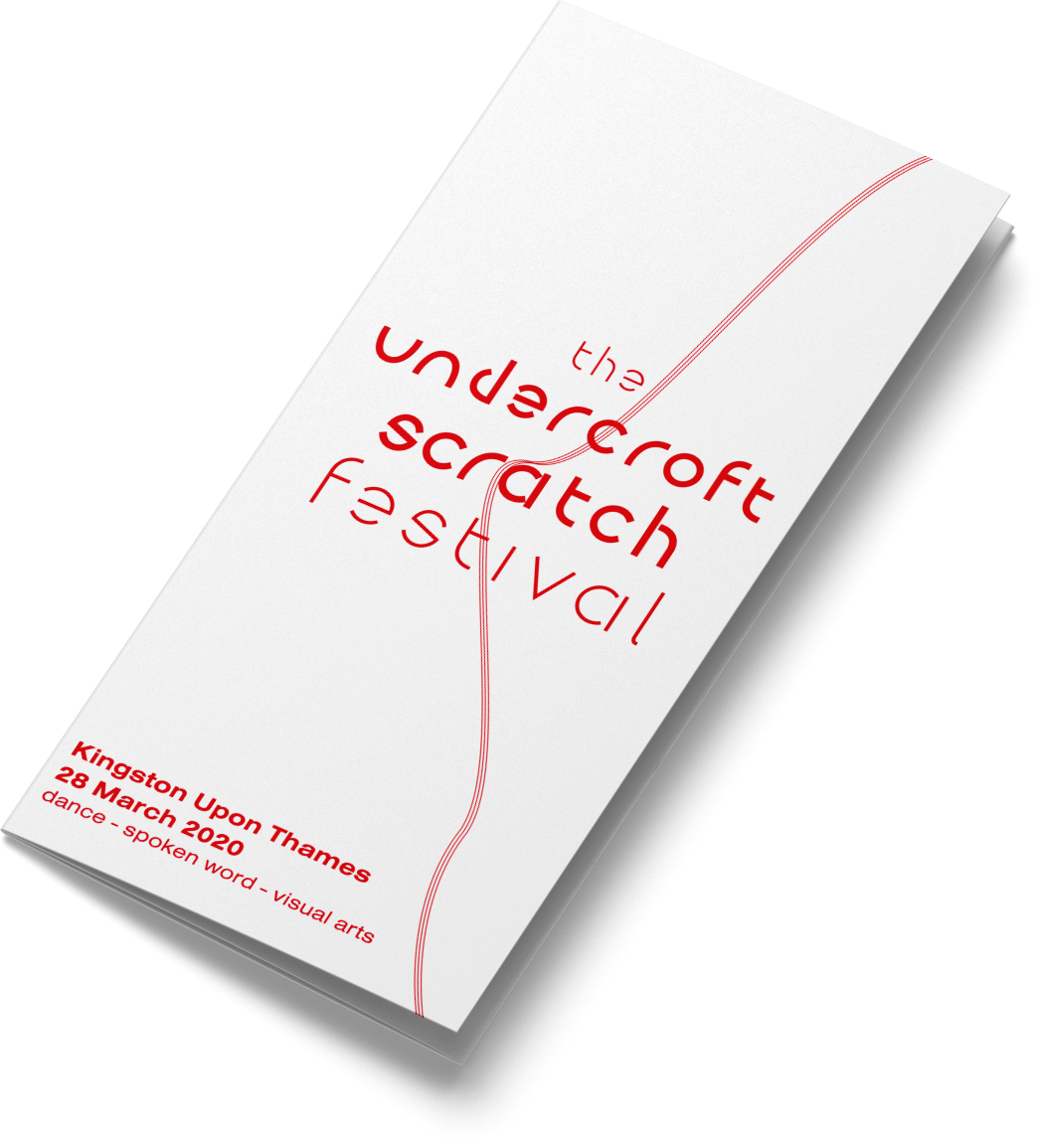
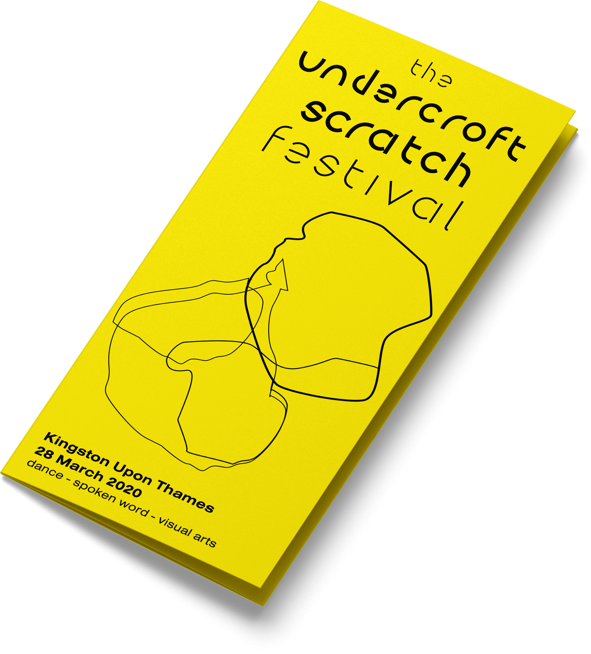
brochure prototypes
© 2022 Ivana Havadejová